McLaren has evolved for more than 60 years, but its latest brand identity starts with something much older.
The new identity brings McLaren Automotive and McLaren Racing into one connected visual expression, while going back to the people, symbols and stories that shaped the brand in the first place.
The thinking is that McLaren has never been comfortable following established paths. From Bruce McLaren’s early racing experiments to the McLaren F1 and today’s work across Formula 1, IndyCar and WEC, the brand has always been built around the idea of going further.
The new identity tries to make that idea more visible.
One of the most interesting changes is the new McLaren wordmark.
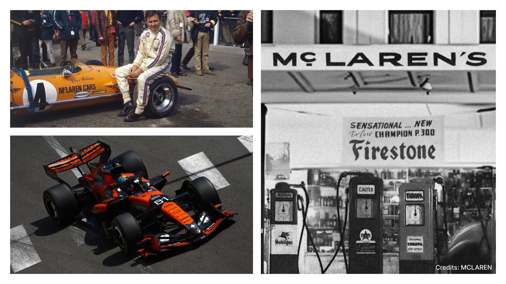
Rather than creating something completely disconnected from the past, the design team went back through McLaren’s archives and found inspiration in a very personal part of the brand’s history: the sign above Bruce McLaren’s family service station in Remuera, Auckland.
The service station was owned by Bruce’s parents, Les and Ruth McLaren. It was also where Bruce built the car that eventually took him to his first racing victory. That original identity has now been done for today.
For designers, this is an important distinction. Heritage does not always have to mean bringing an old logo back exactly as it was. Sometimes, the more useful approach is to find an overlooked piece of history and reinterpret it in a way that works for the brand today.

The redesign also shows that evolution does not mean changing everything.
The Speedmark, one of McLaren’s most recognisable symbols, remains at the centre of the identity. The Speedy Kiwi stays too, continuing to represent Bruce McLaren’s New Zealand roots.
And then there is Papaya. The colour has become one of the strongest visual associations with McLaren, particularly through its racing identity. It remains a defining part of the brand, but the new system expands beyond it with a broader colour palette inspired by important moments in McLaren’s history.
This creates a balance as the elements people already recognise remain intact, while the wider system gets more room to grow.

This is where the redesign becomes more than a visual exercise.
McLaren is trying to build a brand that extends beyond its cars and racing results.
The new identity is designed to support a wider expression of McLaren ownership and fandom, including more personalisation, richer experiences and a stronger sense of community.
That matters because McLaren today operates across very different parts of the automotive and racing world.
There is McLaren Racing across F1, IndyCar and WEC. There is McLaren Automotive and its road cars. And the company is also expanding its ambitions, including a £500 million UK manufacturing and engineering investment programme and plans to move beyond two-seater supercars with an upcoming performance SUV.
A visual identity built only around one product or one era would make that expansion harder.
The new system needs to be able to represent all of it.

The most useful lesson from McLaren’s redesign is that a brand evolution does not need to choose between heritage and progress.
The strongest elements of the old McLaren are still there but they now sit inside a broader system that can support new products, experiences, communities and markets.
The process is equally interesting. Instead of starting with a blank page, McLaren Racing and Automotive went back through their shared archives to understand the symbols, stories and details that had shaped the company from Bruce McLaren’s early years in New Zealand to the global brand it is today.
That is a useful approach for any designer working on an established brand.
Before replacing something familiar, understand why people remember it.


