Calendly started with a simple problem: finding a time to meet.
Today, the product does much more. It is expanding into payments, meeting notes, contacts and AI, making the idea of a calendar link feel much bigger than it once did.
Its new identity, designed by Smith & Diction, is built around making space.
And instead of representing time with clocks, calendars or schedules, the new design tries to show what time can create.


The most noticeable change is the new C-shaped symbol.
It is based on the idea of a ripple. One meeting can lead to another conversation, a new relationship, an opportunity or an unexpected outcome.
That makes the symbol more than an updated logo. It gives Calendly a visual way to talk about the impact of a meeting rather than the act of scheduling one.
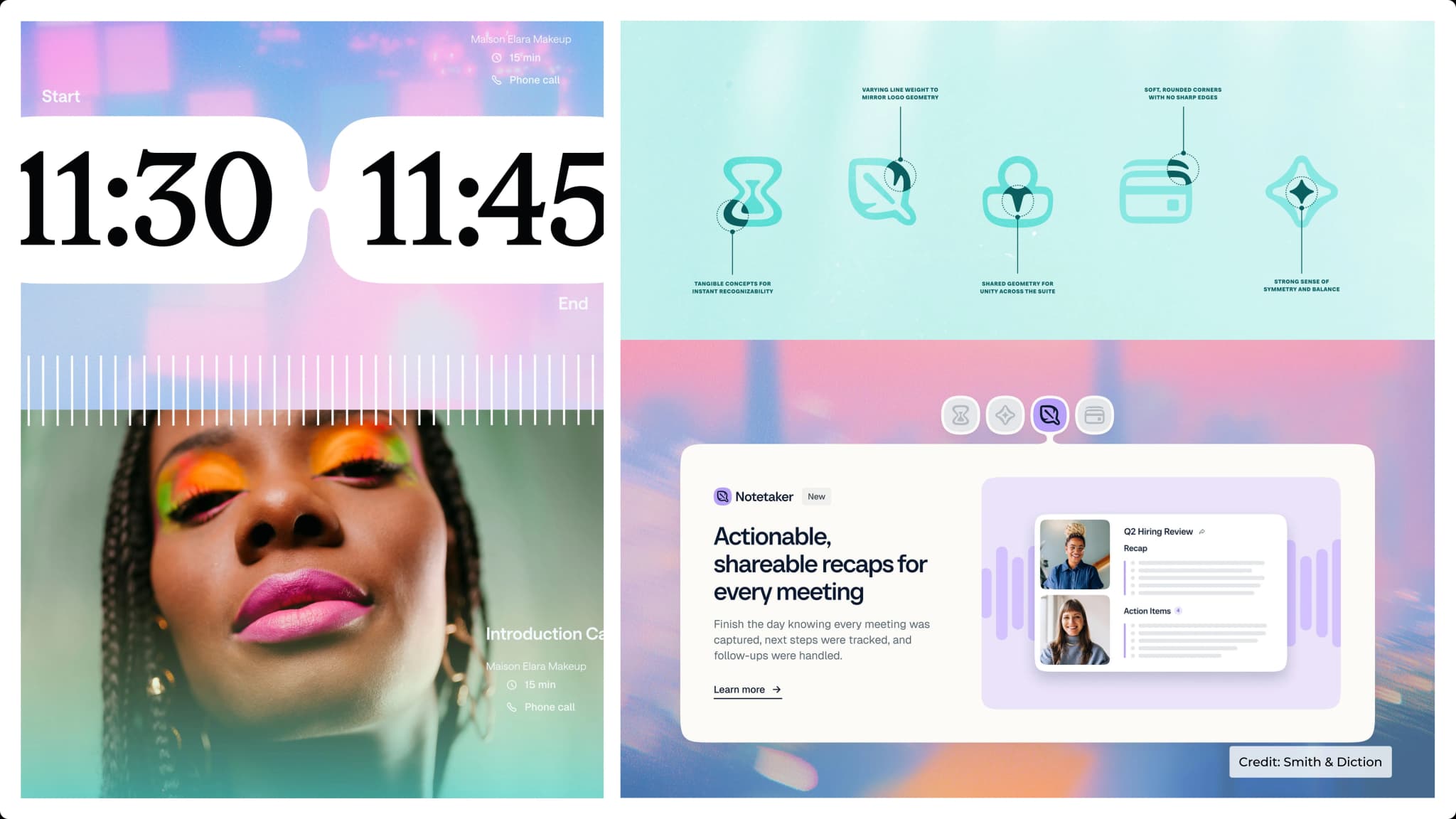
The same idea appears throughout the identity. The wordmark has more connected forms, product icons follow a similar language, and the new Flex Bubble system can expand and change depending on where it is used.
This gives the brand a visual system that can adapt as the product continues to grow.


Time is difficult to represent visually because you cannot actually see it.
Calendly's answer is to represent the feeling around it instead.
The new identity uses a blue-led colour palette, soft gradients, blurred imagery and patterns created with Patternly. These elements are designed to feel fluid rather than rigid, giving the brand a sense of movement and space.
This is an interesting design decision because traditional scheduling products often communicate time through grids, lines, numbers and calendars. Calendly is moving away from that visual language.
Instead of showing how time is organised, it is trying to show what having more time feels like.


The most useful lesson here is how closely the identity is connected to the brand's changing role.
If Calendly were still only a scheduling tool, a calendar-based visual language would make sense. But as the product moves into more parts of the meeting experience, that identity could quickly become limiting.
The new system gives the brand more room to grow.
The flexible shapes, connected forms and softer visual language can work across different products and formats without forcing everything into the same rigid structure.
It also shows why a good rebrand should not only respond to what a company is today. It should create enough flexibility for where the company is going next.


