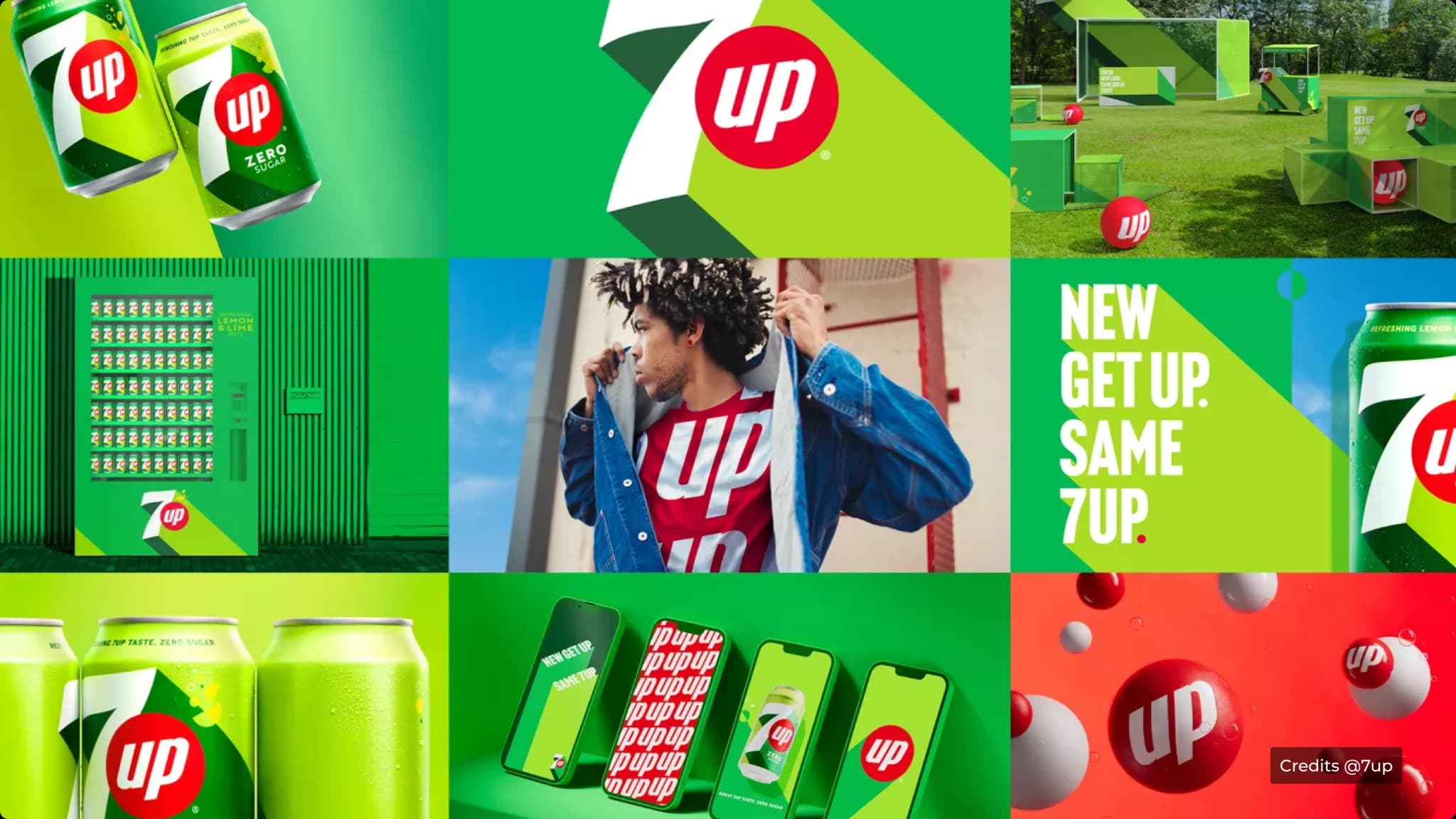
For the first time in more than 15 years, the brand is introducing a new visual identity in the U.S., alongside a new lime-forward formula. The redesign was developed by Keurig Dr Pepper with Deutsch and brings a simpler look to the brand.
Initially, the changes may seem small. But there is a clear change in how 7UP wants to be recognised.

The biggest change is the logo.
The old 7UP identity used the familiar superscripted “UP” treatment, which gave the logo a more playful and uneven structure. The new version brings everything onto the same baseline, uses all capital letters and gives each element a more consistent visual height.
That makes the logo feel cleaner and easier to read.
The colour system has also become richer, while a much larger Lime Lemon label has been introduced as a prominent part of the packaging.
This is important because the flavour itself now becomes a much stronger visual cue.

The simpler logo gives 7UP a more flexible identity.
When all the elements sit on the same baseline, the wordmark becomes easier to use across different sizes and formats. It can work on a can, billboard, digital ad or social post without depending on the more distinctive proportions of the old logo.
The stronger colours help the brand stand out, while the larger Lime Lemon messaging makes the product benefit easier to understand at a glance.
So the redesign is doing two things, making 7UP easier to recognise and making the product easier to understand.
That is a useful distinction for designers. A visual identity has to work quickly, especially in categories where consumers make decisions in seconds.


