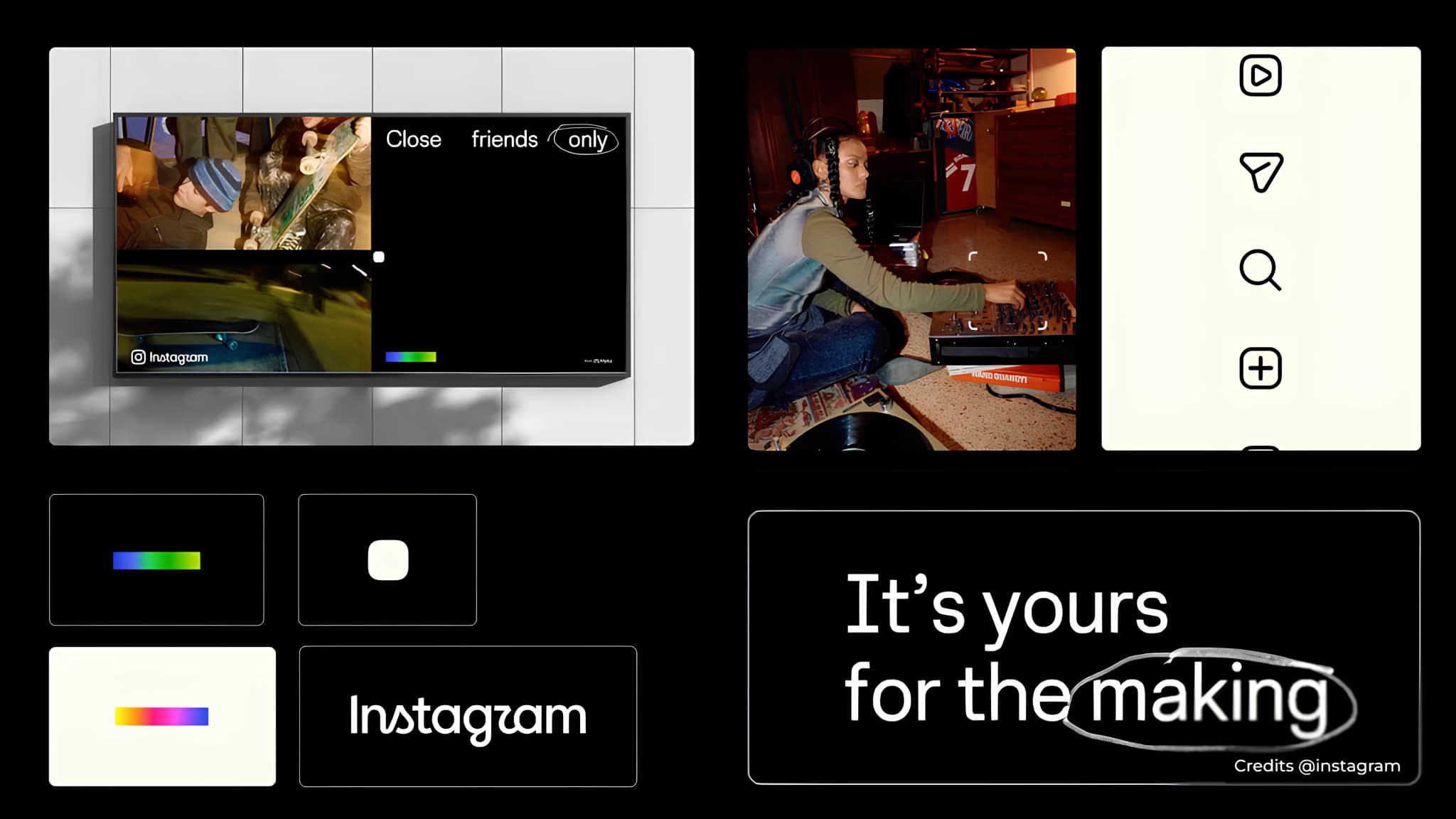
Instagram has changed its wordmark for the first time in nearly a decade.
At first, it may look like a small update. The word “Instagram” is still instantly recognisable. But the team has spent hundreds of iterations refining the curves, spacing and ligatures to make the wordmark feel more connected to the creative nature of the platform.
The bigger idea is Instagram wanted the identity to feel more like the people who use it.
The most noticeable change is the typography.
The new wordmark moves away from the more familiar, straightforward lettering and brings in details inspired by handwriting and craft lettering. Look closely and you can see more distinctive curves in letters like the s, r and g, along with changes to spacing and the way individual letters connect.
These details give the wordmark a more personal and crafted feel.
That is an interesting choice for a platform built around individual creativity. Instagram isn't just a place where people consume content anymore. People use it to make photographs, videos, illustrations, fashion, music, design and much more.
The new wordmark is designed to reflect that.
The refresh also extends beyond the wordmark. Instagram has updated its broader brand system across type, motion and colour, giving the identity more flexibility across different kinds of content and communication.
This is important because a platform like Instagram cannot rely on one logo to carry its identity. Its brand appears across videos, Stories, Reels, campaigns, creator content and product experiences. The wider system needs to work around all of that without competing with the content itself.
The previous wordmark had been around for almost a decade. In that time, the platform and the way people use it have changed significantly.
The new version gives the brand a more contemporary and distinctive character without making it unrecognisable.
That balance is difficult to achieve.
There is also an interesting tension here. Some people have already joked that certain letters look unfamiliar, particularly the new r. But that reaction also highlights an important design principle: when you make typography more expressive, you sometimes give up a little familiarity in exchange for more character.
For a brand as recognisable as Instagram, that can be a worthwhile trade-off.


