When you're one of the most recognizable brands in the world, redesigning means becoming more yourself.
That's exactly what Coca-Cola's latest global brand refresh tries to do.
Developed with JKR, the refresh touches almost every part of the brand ecosystem, from packaging and typography to retail experiences and internal design tools. The changes initially may look simple. But when you're operating across more than 200 markets and billions of touchpoints, even small refinements can have a massive impact.
What's interesting is that Coca-Cola is doubling down on the assets that made the brand iconic in the first place.
The biggest change is a renewed focus on Coca-Cola's most recognizable brand elements.
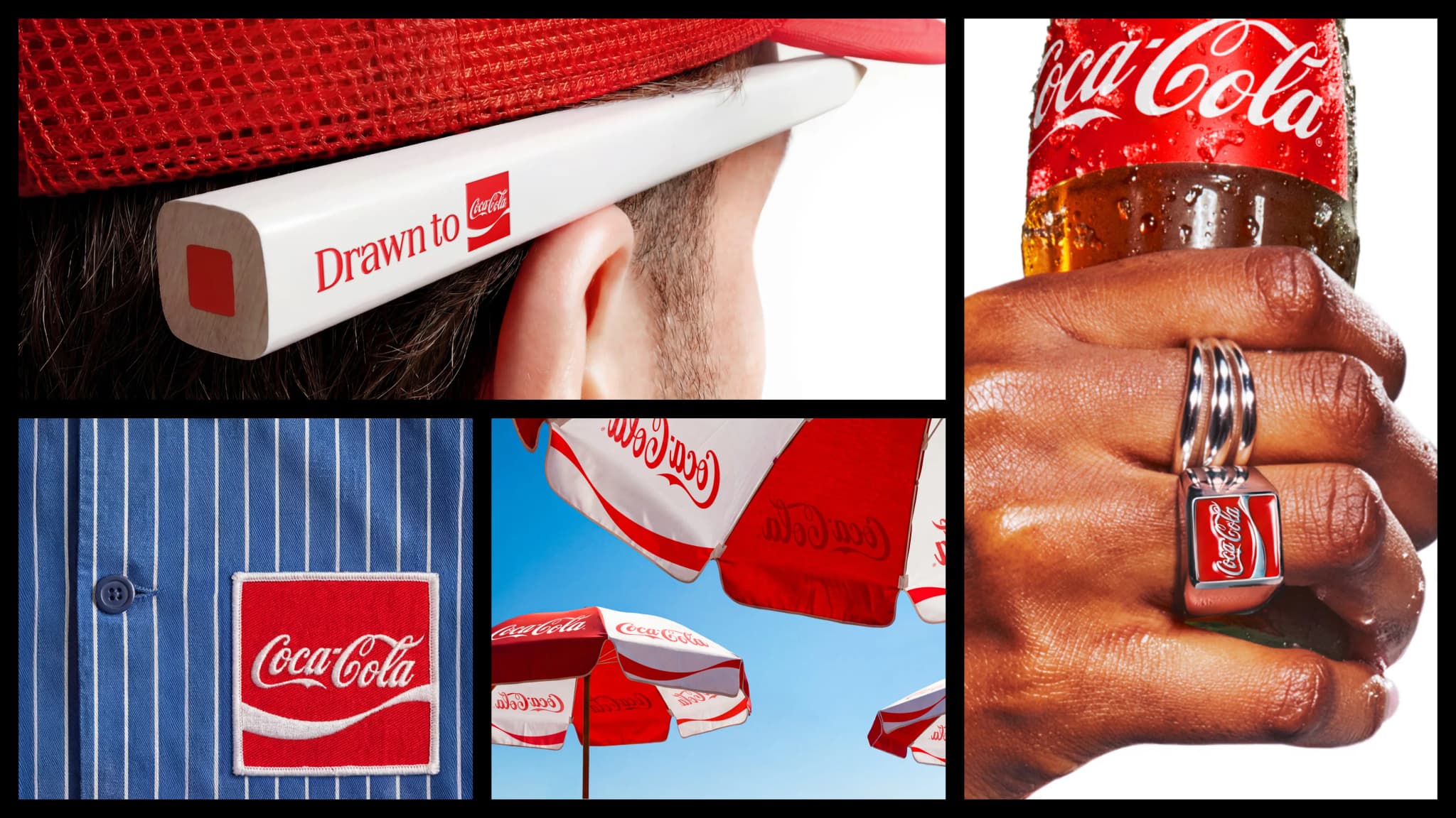
The refresh brings back the Arden Square, one of the brand's historic design assets that has appeared throughout Coca-Cola's visual history. It also sharpens the red and white colour system and gives more prominence to the Dynamic Ribbon, a visual device that has been associated with the brand for years.
The packaging system has also been redesigned in partnership with Super Ultra Rare. The goal is to make Coca-Cola look Coca-Cola, whether you're holding a can in Tokyo, Mumbai, London, or New York.
Another important addition is Better With, a custom serif typeface developed with Brody Associates. While Coca-Cola has always been known for its Spencerian script logo, the new typeface gives the brand a broader typographic system that can work across campaigns, retail, packaging and digital experiences while still feeling connected to its heritage.
Beyond visuals, Coca-Cola has also invested heavily in how the brand is managed internally. To support teams across hundreds of markets, it launched a new Brand Center and introduced AI-powered Design Intelligence tools. These systems are designed to help teams create assets faster while maintaining consistency across packaging, vending machines, retail environments and digital platforms.


Many rebrands focus on adding something new.
Coca-Cola's refresh focuses on making existing assets stronger. That might sound simple, but it's one of the hardest things for a global brand to do.
When brands become as large as Coca-Cola, different teams, markets, agencies and campaigns often interpret brand guidelines differently. Over time, distinctive assets can lose their impact because they're used inconsistently.
This refresh feels like an effort to solve that problem.
Rather than introducing a completely new visual language, Coca-Cola is strengthening the pieces people already recognize. The result is a system that feels familiar while also feeling sharper.


