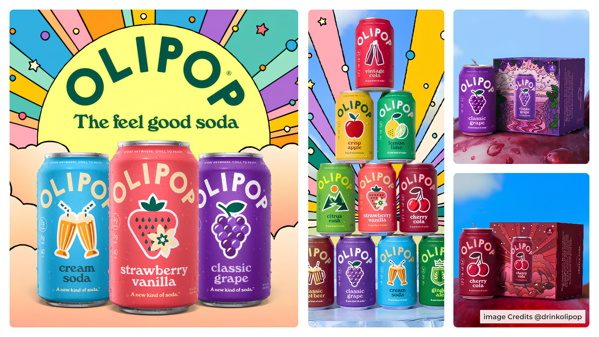
Most functional drinks look too clinical, serious or focused on “health” to feel like something you would casually pick up and enjoy every day. The packaging often talks more about ingredients than experience.
That is exactly what OLIPOP is trying to change with its new rebrand.
The company has introduced a refreshed visual identity and packaging system designed to make functional soda feel less like a wellness product and more like a soda people genuinely want to drink daily.
The new OLIPOP packaging uses brighter colors, stronger contrast, and more visible flavor cues to improve shelf visibility and make each can easier to recognize instantly. Compared to the older system, the new design feels more energetic, playful, and emotionally driven.
Instead of leaning heavily into “gut health” aesthetics, the brand now looks closer to a mainstream soda brand while still keeping its functional positioning intact.
Another major update is the information hierarchy.
Nutritional details like fiber, sugar, and calorie content are now easier to understand at a glance. Instead of hiding the functional benefits in small text, the packaging organizes information more clearly so consumers can quickly understand both the flavor and the health proposition.
That matters a lot in retail environments where purchase decisions happen within seconds.
The redesign is also part of OLIPOP’s larger “The Feel Good Soda” campaign platform.


