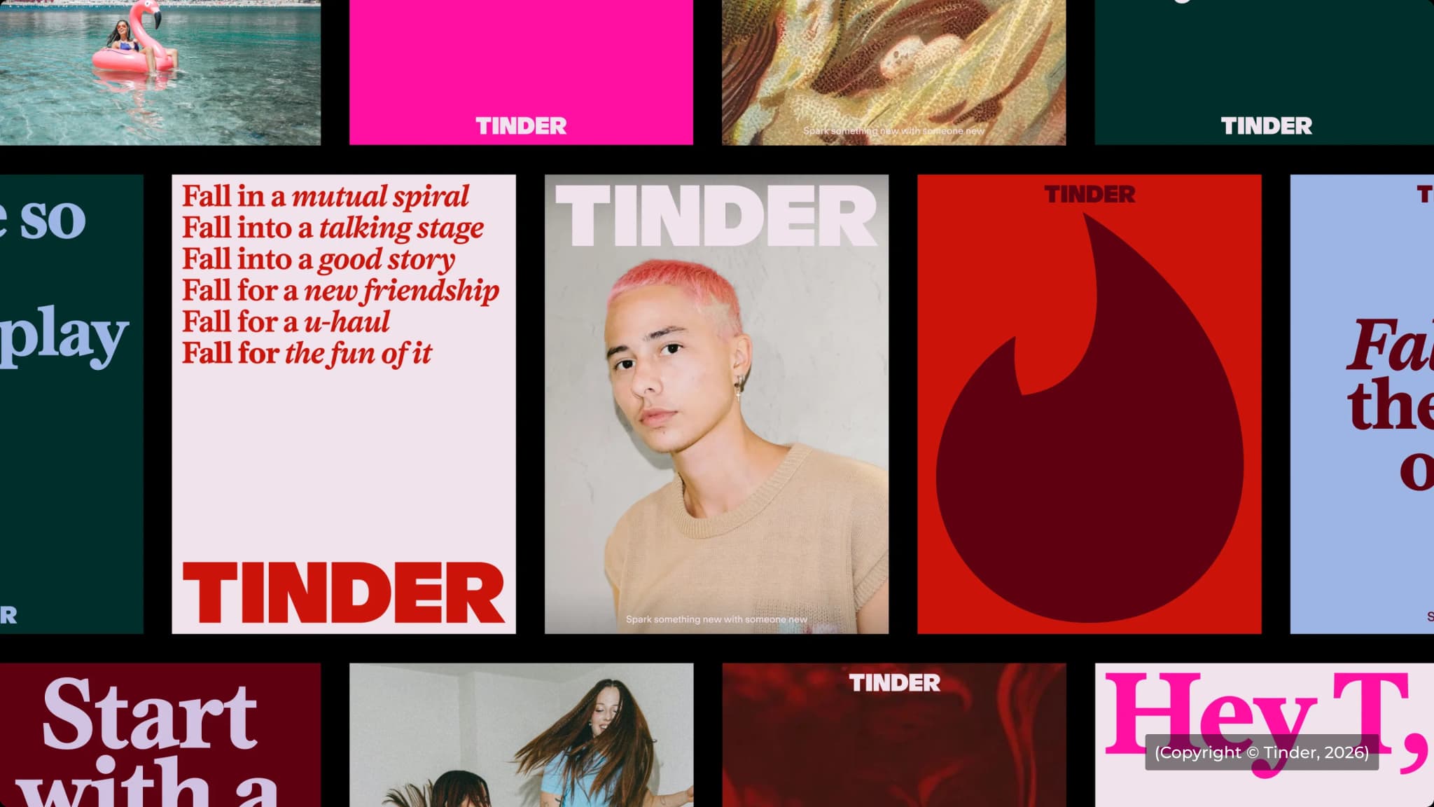
Tinder's latest rebrand is basically not trying to appeal to everyone!
For its first major rebrand in nearly a decade, Tinder partnered with Porto Rocha to rethink how the brand speaks to a generation that is full of contradictions. A generation that is tired of dating apps but still uses them, that values authenticity but spends hours online, that wants real connections while constantly checking digital culture.
Instead of smoothing over those contradictions, Tinder decided to embrace them.
The result is a rebrand that feels less like a dating app and more like a brand to connect with modern audiences.
Tinder has introduced a refreshed visual system that includes a reworked wordmark, a new serif typeface and a much broader range of visual references. Alongside polished photography, you'll find anime stills, classical oil paintings, internet memes, screenshots and cultural imagery that feels pulled directly from the feeds people spend hours scrolling through every day.
What makes this interesting is that these elements don't naturally belong together.
Traditionally, brands are taught to create consistency by reducing variation. Tinder has taken a different approach. The system is intentionally broad because it reflects the reality of its audience. Today's users consume everything from Renaissance art to IG edits in the same hour. Their visual world isn't neatly curated, so Tinder's isn't either.
One line from the team captures this perfectly:
"They're burnt out on dating but holding out hope it could work; nostalgic for tradition but inventing a lot of new norms; maxing and rotting; craving reality, but escaping to fantasy."
That tension becomes the foundation of the entire identity.
The most interesting part of this rebrand is the fact that Tinder finally has a clear point of view.
For years, many large consumer brands have tried to stay neutral and broadly appealing. The downside is that they often end up sounding interchangeable.
Tinder's new identity takes a different route. It acknowledges that its audience is messy, contradictory and difficult to define. Rather than creating a brand that feels universally relatable, it creates one that feels culturally aware.
That's a subtle but important difference. Tinder is saying, "We understand the world you're living in."
There are a few important lessons here for designers.
The first is that consistency doesn't always mean uniformity. For years, brand systems were built around control. Every image, colour and layout needed to feel tightly managed. But digital culture moves too quickly for that. Tinder's identity shows that a brand can remain recognizable while allowing for a much wider range of visual expression.
The second lesson is that great design systems start with a strong strategic insight. The new typography, imagery, and visual language all come from one understanding that modern dating is full of contradictions. Once that insight was identified, the creative decisions became much easier to justify.


