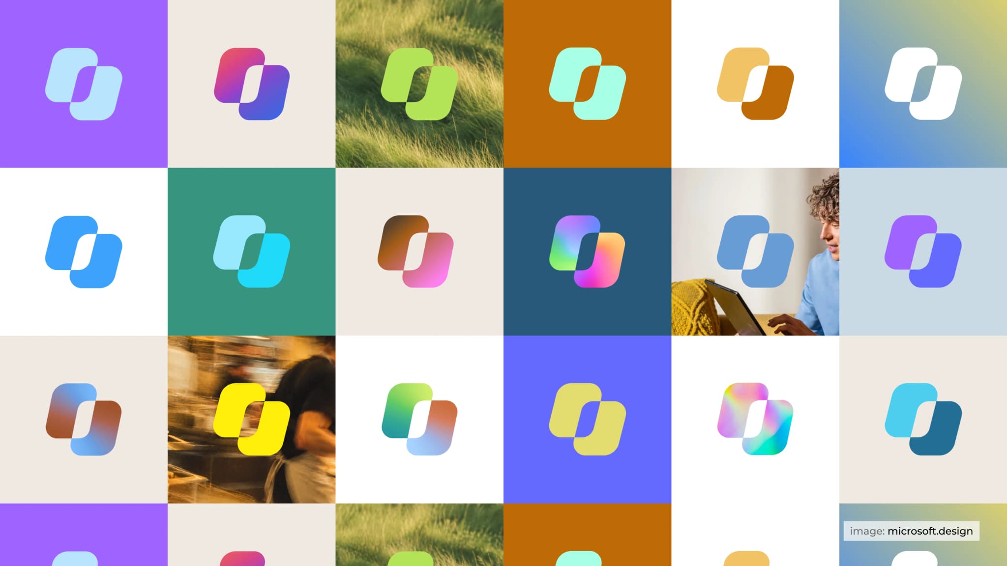
Most app icons are designed to help you recognise a product. Microsoft wants Copilot’s icon to do something more: communicate what the AI is doing while you use it.
The company recently redesigned Copilot’s visual identity around a simple idea: work becomes more powerful when everything comes together. The new icon uses two distinct shapes that form one mark, with colour and motion helping communicate what happens behind the scenes.
The change might look small, but it solves a bigger design problem. Copilot is no longer just an app you open and ask questions. It works across Microsoft products, understands context, helps plan tasks and retrieves information from your files. Its identity needed to reflect that growing role.
Here’s what went into the redesign and what designers can learn from it.

Microsoft began the redesign with a basic shape: the square.
The team wanted an icon that could move without becoming difficult to recognise. Since the mark would need to communicate different actions through animation, it had to remain clear in every frame.
The designers experimented with different proportions, angles and spacing. Some versions felt too static, while others became unnecessarily complicated.
Eventually, they settled on two distinct forms that come together to create one recognisable silhouette. The shapes can move independently while remaining visually connected.
This is also the main idea behind the design. Two separate elements come together to create something more useful, much like Copilot brings different tools, information and tasks into one experience.
For designers, the important detail is that the concept and the shape work together. The icon isn't simply a symbol chosen for its appearance. Its construction helps explain what the product is trying to achieve.

The redesign also brings a change to the Copilot wordmark.
Microsoft uses Segoe, the humanist typeface already familiar across its products, alongside Segoe Serif.
The sans-serif typeface keeps the wordmark open and easy to read, while the serif adds a little more character. Both retain their own qualities while working together as one identity.
This follows the same thinking as the icon: two different elements can have distinct roles without looking disconnected.
It also helps Copilot feel connected to Microsoft's wider design language instead of looking like an entirely separate product.

Copilot's original gradient remains an important part of the identity, but the redesign gives colour more room to move.
The team tested gradients that travel along the curves, shift between the two forms and create depth. These experiments were tested across screens, printed materials and physical applications.
Some versions looked good on their own but did not work as well alongside the rest of the brand. Those tests helped the team understand how expressive the identity could be without losing consistency.
The final direction allows colours to blend and shift depending on the context, while maintaining a connection to Copilot's original look.
This is a useful lesson in designing visual identities for digital products. A gradient or colour palette should do more than make an icon attractive. It needs to work across different backgrounds, sizes, materials and applications without losing recognition.

The most interesting part of the redesign is what happens when the icon moves.
Think about using an AI assistant. You submit a request, and then you wait. Is it processing your question? Is it organising a plan? Is it searching through your files?
A static icon cannot tell you much about what is happening. Motion can help communicate that activity.
Microsoft built a motion system around three stages of Copilot's work:
Thinking: The icon communicates that Copilot is working through your request.
Planning: Its movement represents the process of organising the next steps.
Retrieval: The animation represents Copilot gathering relevant context from your files and work.
Each action uses the same two forms, moving in relation to each other and coming back together.
The idea is to make the icon part of the product experience rather than something that simply sits in the corner of the screen. Its movement can give users a visual cue about the kind of work Copilot is doing.
The same motion language follows Copilot across Microsoft's ecosystem, so the experience feels familiar whether you encounter it in Windows, Word or PowerPoint.
The final result may look straightforward, but getting there took months of work from brand, product and motion designers.
The team printed icons to see how they looked on paper, debated small details such as the weight of a curve, and tested how the mark behaved in different contexts. Some decisions were revisited after the team had spent more time with the designs.
That process matters because an icon that looks good in a design file may not work equally well everywhere. It needs to remain recognisable at different sizes, work across different materials and fit naturally into the wider product experience.
Copilot also appears across many touchpoints, from individual conversations in apps to larger product experiences and global advertising. The identity needed to connect those moments without becoming repetitive or limiting.
The new icon is one part of that larger system, with the same idea carried through the wider Copilot identity.


